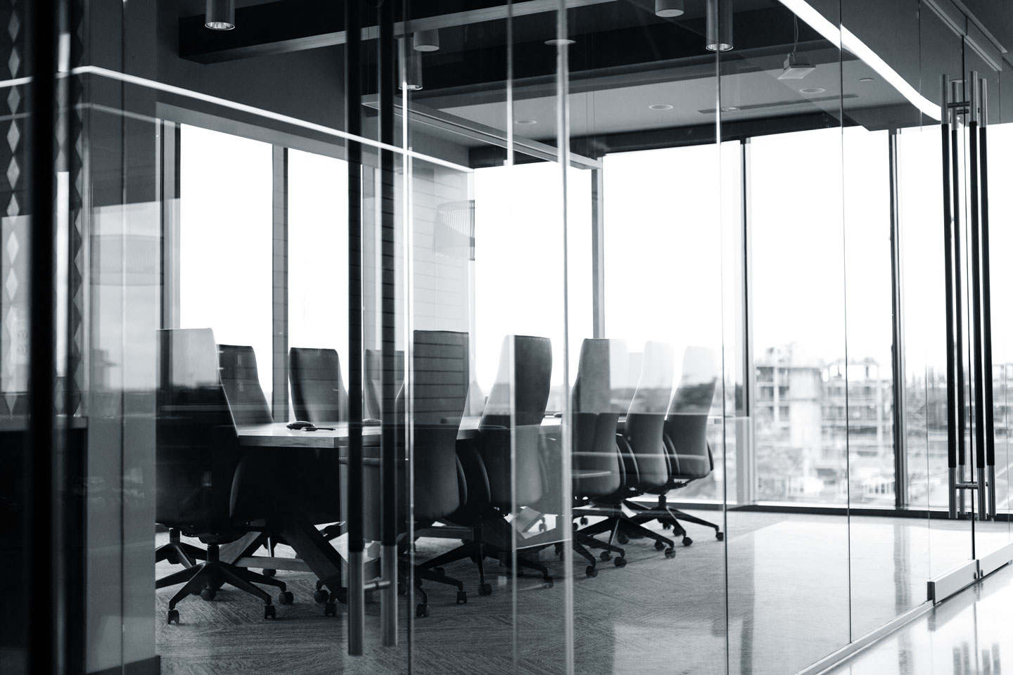
Beyond aesthetics, how color is used in certain spaces must be strategic and intentional. Picking the right paint color for your office space or residence sets the tone, and can impact the overall wellbeing and productivity of its user.
In an article by Entrepreneur, certain colors affect moods and can trigger different reactions in the user’s brain. Motivating colors to create engaging workspaces prove to be more crucial as people begin to spend the majority of time in their offices.
Here’s a rundown of colors to consider for certain industries:
- Blue or green for maximum efficiency, calmness
The colors blue and green have always exuded feelings of calm and tranquility. According to psychologists, this is the preferred color for those in fast-paced or demanding jobs that deal with highly technical or intellectual stuff.
Green, on the other hand, is associated with nature or the outdoors which help in increasing happiness or satisfaction. It also helps ease eye strain caused by screen time.
Given its ability to promote harmony, tasks get completed faster, and users tend to get better brain stimulation that assists in confidence building.
However, picking certain hues of blue that may be perceived as cold or uninviting may increase discomfort.
- Yellow and purple boost creativity
These colors are often considered the color of creativity and exude innovation. The colors increase energy levels which helps with motivation and focus.
Yellow helps promote enthusiasm, positivity, and even mental clarity while purple triggers the user’s intuition, and enhances decision making which is especially beneficial for designers or marketers.
- Red and orange trigger alertness, high activity
Spending great lengths of time in any space may cause feelings of sleepiness or lethargy. These colors, if used as accents, can capture attention and boost stimulation.
Red is known to elevate blood flow and heart rate that help with work that requires attention to detail. Combining certain colors with orange helps retain engagement and focus, and trigger strong reactions from users.
- Gray and white for sophistication, cleanliness
Gray and white are perceived as colors of neutrality and reliability. Businesses and homeowners often use it as backdrop in spaces where visitors or clients are received or met.
Light gray or white is not seen as distracting, overwhelming, or conjures eye fatigue.
On Colors and Wellness

According to Corporate Wellness, employing color psychology strategies help boost wellness in spaces given its ability to impact emotions, behavior, and perceptions.
Combining warm and cool colors strategically can significantly affect users’ mental state, mood, and physical health. Using the right colors can reduce stress, enhance mood, and even encourage rest to ensure maximum efficiency and effectiveness of space created.
Professional interior designers can help assess your general vision or organization’s culture and values in selecting colors for different spaces.
Consultations are done to understand the purpose of spaces and nature of its users that will help map out how a space is built.
Get expert guidance for every build. Contact Corebilt at bd@corebilt.ph to discuss your requirements and visions.


